
Prevously, we used logistic regression on polling data in order to construct US presidential election predictions. We separated our data into a training set, containing data from 2004 and 2008 polls, and a test-set, containing the data from 2012 polls. We then proceeded to develop a logistic regression model to forecast the 2012 US presidential election.
In this problem, we’ll revisit our logistic regression model, and learn how to plot the output on a map of the United States. Unlike what we did prevously, this time we’ll be plotting predictions rather than data!
First, load the ggplot2, maps, and ggmap packages using the library function. All three packages should be installed on your computer from lecture, but if not, you may need to install them too using the install.packages function.
Then, load the US map and save it to the variable statesMap:
statesMap = map_data(“state”)
The maps package contains other built-in maps, including a US county map, a world map, and maps for France and Italy.
# Load states map
statesMap = map_data("state")
Problem 1.1 - Drawing a Map of the US
If you look at the structure of the statesMap dataframe using the str function, you should see that there are 6 variables. One of the variables, group, defines the different shapes or polygons on the map. Sometimes a state may have multiple groups, for example, if it includes islands.
How many different groups are there?
str(statesMap)'data.frame': 15537 obs. of 6 variables:
$ long : num -87.5 -87.5 -87.5 -87.5 -87.6 ...
$ lat : num 30.4 30.4 30.4 30.3 30.3 ...
$ group : num 1 1 1 1 1 1 1 1 1 1 ...
$ order : int 1 2 3 4 5 6 7 8 9 10 ...
$ region : chr "alabama" "alabama" "alabama" "alabama" ...
$ subregion: chr NA NA NA NA ...length(table(statesMap$group))[1] 63The variable “order” defines the order to connect the points within each group, and the variable “region” gives the name of the state.
Problem 1.2 - Drawing a Map of the US
You can draw a map of the US by typing the following code:
ggplot(statesMap, aes(x = long, y = lat, group = group)) +
    geom_polygon(fill = "white", color = "black")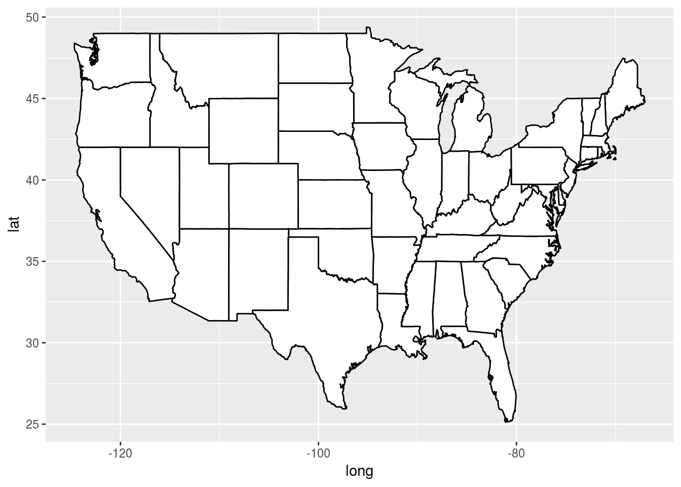
We specified two colors in geom_polygon – fill and color. Which one defined the color of the outline of the states? #### color
Problem 2.1 - Coloring the States by Predictions
Now, let’s color the map of the US according to our 2012 US presidential election predictions from the Unit 3 Recitation. We’ll rebuild the model here, using the dataset PollingImputed.csv. Be sure to use this file so that you don’t have to redo the imputation to fill in the missing values, like we did in the Unit 3 Recitation.
Load the data using the read.csv function, and call it “polling”. Then split the data using the subset function into a training set called “Train” that has observations from 2004 and 2008, and a testing set called “Test” that has observations from 2012.
polling <- read.csv("PollingImputed.csv")
str(polling)
'data.frame': 145 obs. of 7 variables:
$ State : Factor w/ 50 levels "Alabama","Alaska",..: 1 1 2 2 3 3 3 4 4 4 ...
$ Year : int 2004 2008 2004 2008 2004 2008 2012 2004 2008 2012 ...
$ Rasmussen : int 11 21 19 16 5 5 8 7 10 13 ...
$ SurveyUSA : int 18 25 21 18 15 3 5 5 7 21 ...
$ DiffCount : int 5 5 1 6 8 9 4 8 5 2 ...
$ PropR : num 1 1 1 1 1 ...
$ Republican: int 1 1 1 1 1 1 1 1 1 1 ...table(polling$Year)
2004 2008 2012
  50   50   45
Train <- subset(polling, Year <= 2008)
Test <- subset(polling, Year > 2008)
str(Train)'data.frame': 100 obs. of 7 variables:
$ State : Factor w/ 50 levels "Alabama","Alaska",..: 1 1 2 2 3 3 4 4 5 5 ...
$ Year : int 2004 2008 2004 2008 2004 2008 2004 2008 2004 2008 ...
$ Rasmussen : int 11 21 19 16 5 5 7 10 -11 -27 ...
$ SurveyUSA : int 18 25 21 18 15 3 5 7 -11 -24 ...
$ DiffCount : int 5 5 1 6 8 9 8 5 -8 -5 ...
$ PropR : num 1 1 1 1 1 1 1 1 0 0 ...
$ Republican: int 1 1 1 1 1 1 1 1 0 0 ...str(Test)'data.frame': 45 obs. of 7 variables:
$ State : Factor w/ 50 levels "Alabama","Alaska",..: 3 4 5 6 7 9 10 11 12 13 ...
$ Year : int 2012 2012 2012 2012 2012 2012 2012 2012 2012 2012 ...
$ Rasmussen : int 8 13 -12 3 -7 2 5 -22 31 -22 ...
$ SurveyUSA : int 5 21 -14 -2 -13 0 8 -24 24 -16 ...
$ DiffCount : int 4 2 -6 -5 -8 6 4 -2 1 -5 ...
$ PropR : num 0.833 1 0 0.308 0 ...
$ Republican: int 1 1 0 0 0 0 1 0 1 0 ...Note that we only have 45 states in our testing set, since we are missing observations for Alaska, Delaware, Alabama, Wyoming, and Vermont, so these states will not appear colored in our map.
Then, create a logistic regression model and make predictions on the test-set using the following code:
mod2 <- glm(Republican ~ SurveyUSA + DiffCount,
            data = Train, family = "binomial")
TestPrediction <- predict(mod2, newdata = Test, type = "response")
TestPrediction gives the predicted probabilities for each state, but let’s also create a vector of Republican/Democrat predictions by using the following code:
TestPredictionBinary <- as.numeric(TestPrediction > 0.5)Now, put the predictions and state labels in a data.frame so that we can use ggplot:
predictionDataFrame <-
    data.frame(TestPrediction, TestPredictionBinary, Test$State)
To make sure everything went smoothly, answer the following.
For how many states is our binary prediction 1 (for 2012), corresponding to Republican?
str(TestPredictionBinary) num [1:45] 1 1 0 0 0 1 1 0 1 0 ...table(TestPredictionBinary)TestPredictionBinary
0 1
23 22 22
What is the average predicted probability of our model (on the Test set, for 2012)?
mean(TestPrediction)[1] 0.4852626Problem 2.2 - Coloring the States by Predictions
Now, we need to merge “predictionDataFrame” with the map data “statesMap”. Before doing so, we need to convert the Test.State variable to lowercase, so that it matches the region variable in statesMap.
predictionDataFrame$region <- tolower(predictionDataFrame$Test.State)
# Now, merge the two data frames using the following command:
predictionMap <- merge(statesMap, predictionDataFrame, by = "region")
# Lastly, we need to make sure the observations are in order so that the map is
# drawn properly, by typing the following:
predictionMap <- predictionMap[order(predictionMap$order),]
How many observations are there in predictionMap?
str(predictionMap)'data.frame': 15034 obs. of 9 variables:
$ region : chr "arizona" "arizona" "arizona" "arizona" ...
$ long : num -115 -115 -115 -115 -115 ...
$ lat : num 35 35.1 35.1 35.2 35.2 ...
$ group : num 2 2 2 2 2 2 2 2 2 2 ...
$ order : int 204 205 206 207 208 209 210 211 212 213 ...
$ subregion : chr NA NA NA NA ...
$ TestPrediction : num 0.974 0.974 0.974 0.974 0.974 ...
$ TestPredictionBinary: num 1 1 1 1 1 1 1 1 1 1 ...
$ Test.State : Factor w/ 50 levels "Alabama","Alaska",..: 3 3 3 3 3 3 3 3 3 3 ...How many observations are there in statesMap?
str(statesMap)'data.frame': 15537 obs. of 6 variables:
$ long : num -87.5 -87.5 -87.5 -87.5 -87.6 ...
$ lat : num 30.4 30.4 30.4 30.3 30.3 ...
$ group : num 1 1 1 1 1 1 1 1 1 1 ...
$ order : int 1 2 3 4 5 6 7 8 9 10 ...
$ region : chr "alabama" "alabama" "alabama" "alabama" ...
$ subregion: chr NA NA NA NA ...Problem 2.3 - Coloring the States by Predictions
When we merged the data in the previous problem, it caused the number of observations to change. Why? Check out the help page for merge by typing ?merge to help us answer this question. #### Because we only make predictions for 45 states, we no longer have observations for some of the states. These observations were removed in the merging process.
Problem 2.4 - Coloring the States by Predictions
Now we are ready to color the US map with our predictions! You can color the states according to our binary predictions by typing the following code:
ggplot(predictionMap,
       aes(x = long, y = lat, group = group, fill = TestPredictionBinary)) +
    geom_polygon(color = "black")
The states appear light blue and dark blue in this map. Which color represents a Republican prediction? #### Light blue
Problem 2.5 - Coloring the States by Predictions
We see that the legend displays a blue gradient for outcomes between 0 and 1. However, when plotting the binary predictions there are only two possible outcomes: 0 or 1.
Let’s replot the map with discrete outcomes. We can also change the color scheme to blue and red, to match the blue color associated with the Democratic Party in the US and the red color associated with the Republican Party in the US.
ggplot(predictionMap,
       aes(x = long, y = lat, group = group, fill = TestPredictionBinary)) +
    geom_polygon(color = "black") +
    scale_fill_gradient(low = "blue", high = "red", guide = "legend",
                        breaks= c(0,1), labels = c("Democrat", "Republican"),
                        name = "Prediction 2012")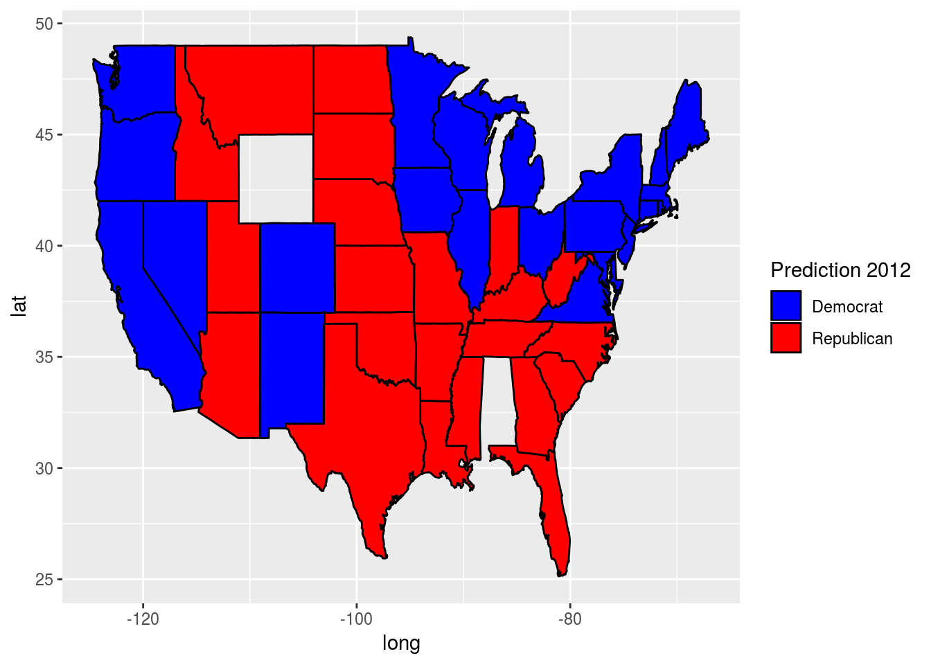
Alternatively, we could plot the probabilities instead of the binary predictions. Change the plot code above to instead color the states by the variable TestPrediction. You should see a gradient of colors ranging from red to blue.
Do the colors of the states in the map for TestPrediction look different from the colors of the states in the map with TestPredictionBinary? Why or why not?
ggplot(predictionMap,
       aes(x = long, y = lat, group = group, fill = TestPrediction)) +
    geom_polygon(color = "black") +
    scale_fill_gradient(low = "blue", high = "red", guide = "legend",
                        breaks= c(0,1), labels = c("Democrat", "Republican"),
                        name = "Prediction 2012")
round(TestPrediction, 2) 7 10 13 16 19 24 27 30 33 36 39 42 45 48 51
0.97 1.00 0.00 0.01 0.00 0.96 0.99 0.00 1.00 0.00 1.00 0.06 0.95 0.99 1.00
54 57 60 63 66 69 72 75 78 81 84 87 90 93 96
0.00 0.00 0.00 0.00 0.00 0.93 1.00 1.00 1.00 0.00 0.00 0.00 0.00 0.00 0.95
99 102 105 108 111 114 117 120 123 126 129 134 137 140 143
1.00 0.00 1.00 0.00 0.00 0.00 1.00 0.99 1.00 1.00 1.00 0.02 0.00 1.00 0.00 The two maps look very similar. This is because most of our predicted probabilities are close to 0 or close to 1.
NOTE: If you have a hard time seeing the red/blue gradient, feel free to change the color scheme, by changing the arguments low = “blue” and high = “red” to colors of your choice (to see all of the color options in R, type colors() in your R console). You can even change it to a gray scale, by changing the low and high colors to “gray” and “black”.
Problem 3.1 - Understanding the Predictions
In the 2012 election, the state of Florida ended up being a very close race. It was ultimately won by the Democratic party. Did we predict this state correctly or incorrectly? To see the names and locations of the different states, take a look at the World Atlas map here. #### We incorrectly predicted this state by predicting that it would be won by the Republican party.
Problem 3.2 - Understanding the Predictions
What was our predicted probability for the state of Florida?
predictionDataFrame[predictionDataFrame$region == "florida", ] TestPrediction TestPredictionBinary Test.State region
24 0.9640395 1 Florida floridaWhat does this imply? #### Our prediction model did not do a very good job of correctly predicting the state of Florida, and we were very confident in our incorrect prediction.
PROBLEM 4 - PARAMETER SETTINGS
In this part, we’ll explore what the different parameter settings of geom_polygon do. Throughout the problem, use the help page for geom_polygon, which can be accessed by ?geom_polygon. To see more information about a certain parameter, just type a question mark and then the parameter name to get the help page for that parameter. Experiment with different parameter settings to try and replicate the plots!
We’ll be asking questions about the following three plots:
Problem 4.1 - Parameter Settings
Plots (1) and (2) were created by setting different parameters of geom_polygon to the value 3.
ggplot(predictionMap,
       aes(x = long, y = lat, group = group, fill = TestPrediction)) +
    geom_polygon(color = "black") +
    scale_fill_gradient(low = "blue", high = "red", guide = "legend",
                        breaks= c(0,1), labels = c("Democrat", "Republican"),
                        name = "Prediction 2012")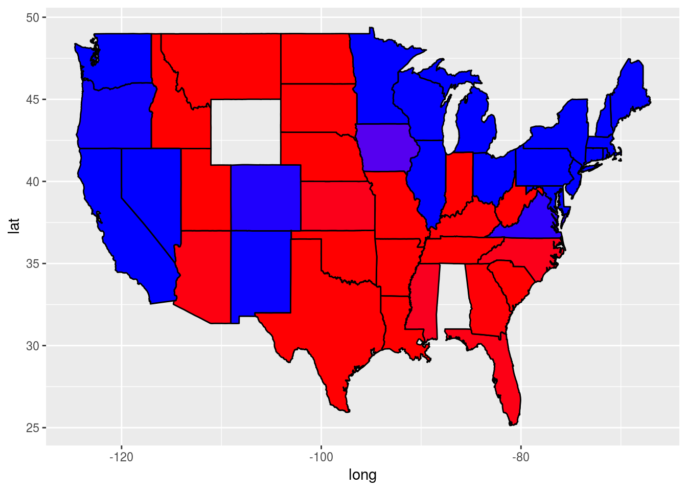
?geom_polygonWhat is the name of the parameter we set to have value 3 to create plot (1)?
ggplot(predictionMap,
       aes(x = long, y = lat, group = group, fill = TestPrediction)) +
    geom_polygon(color = "black", linetype = 3) +
    scale_fill_gradient(low = "blue", high = "red", guide = "legend",
                        breaks= c(0,1), labels = c("Democrat", "Republican"),
                        name = "Prediction 2012")
linetype
What is the name of the parameter we set to have value 3 to create plot (2)?
ggplot(predictionMap,
       aes(x = long, y = lat, group = group, fill = TestPrediction)) +
    geom_polygon(color = "black", size = 3) +
    scale_fill_gradient(low = "blue", high = "red", guide = "legend",
                        breaks= c(0,1), labels = c("Democrat", "Republican"),
                        name = "Prediction 2012")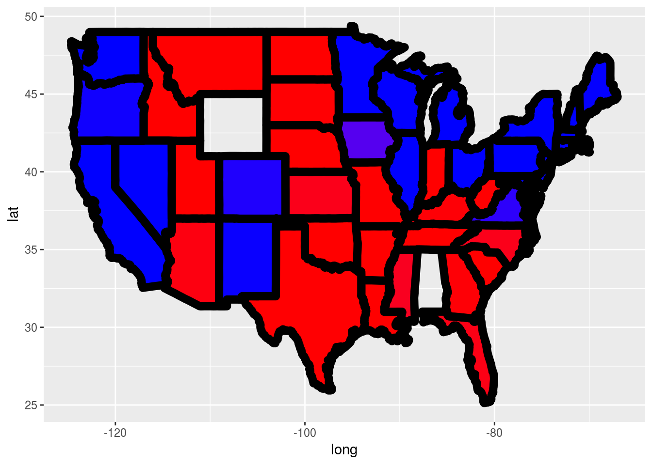
size
Problem 4.2 - Parameter Settings
Plot (3) was created by changing the value of a different geom_polygon parameter to have value 0.3. Which parameter did we use?
ggplot(predictionMap,
       aes(x = long, y = lat, group = group, fill = TestPrediction)) +
    geom_polygon(color = "black", alpha = 0.3) +
    scale_fill_gradient(low = "blue", high = "red", guide = "legend",
                        breaks= c(0,1), labels = c("Democrat", "Republican"),
                        name = "Prediction 2012")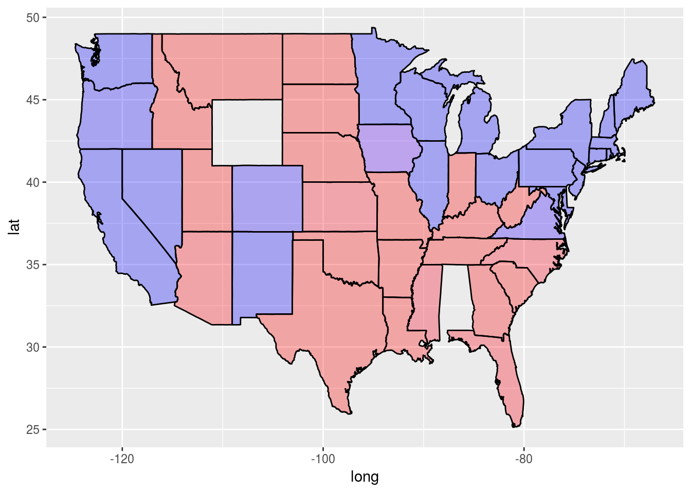
alpha
)